The Brief: The fictional client needed a brand identity for a luxury spa rooted in natural wellness. The design direction called for soft greens, muted earth tones, and beige; elegant serif fonts paired with clean sans-serifs; and nature-inspired elements such as ferns, leaves, or a spa stone symbol. The brand had to feel calm, earthy, and elegant across every touchpoint.
Before opening any design tool, I asked one question: Who is this brand speaking to, and what does she need to feel?
My answer: a professional woman in her 30s or 40s who has built a full life and is quietly running on empty. She doesn't want a spa day. She wants a ritual. That insight became the emotional foundation for every decision that followed.
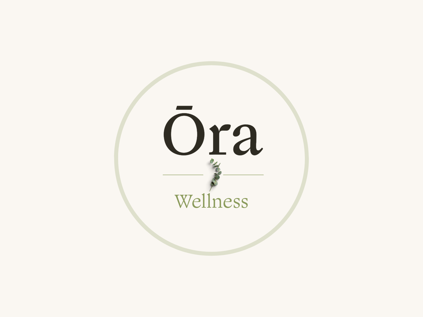
From there, I developed the brand name Ōra Wellness - the macron over the Ō referencing aura, breath, and breeze, signaling the careful attention to detail the brand would carry throughout.
This project taught me that the brief is not a cage - it's a starting point. The real work is finding the why beneath the what.
Once I understood who Ōra was speaking to and what she needed to feel, every design decision became easier to defend and more cohesive to execute. The hardest lesson was restraint: every time I wanted to add more, the brief reminded me that luxury is not excess. It is intention.